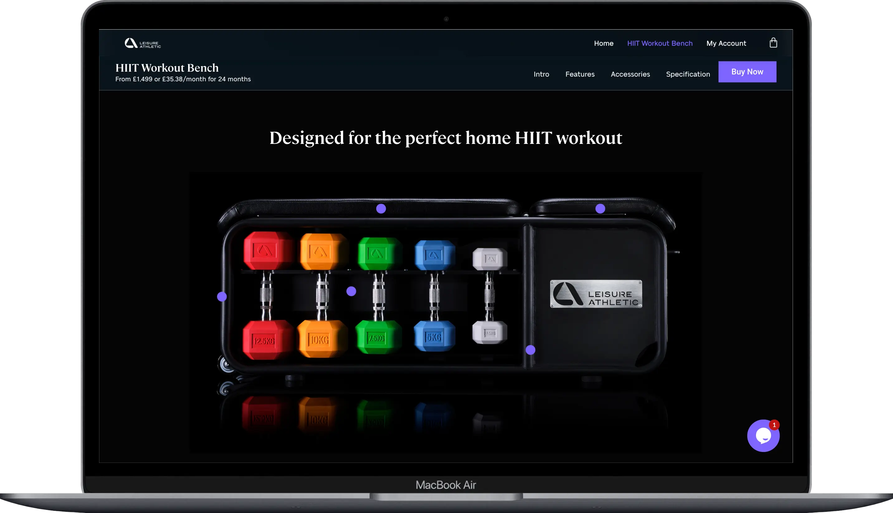
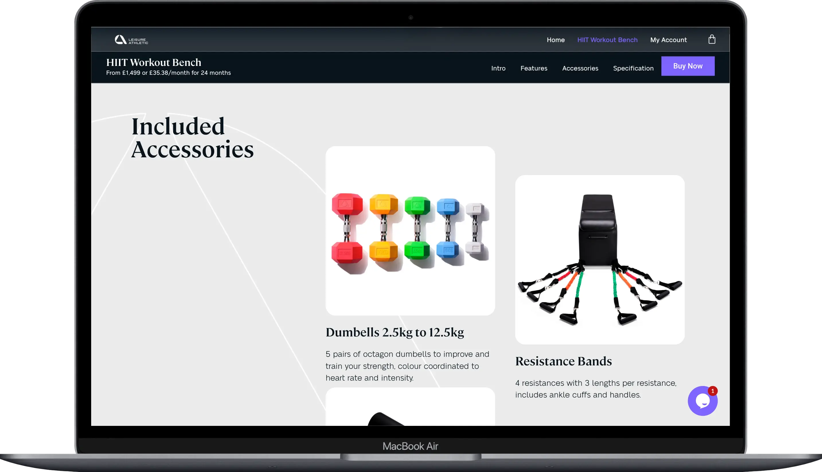
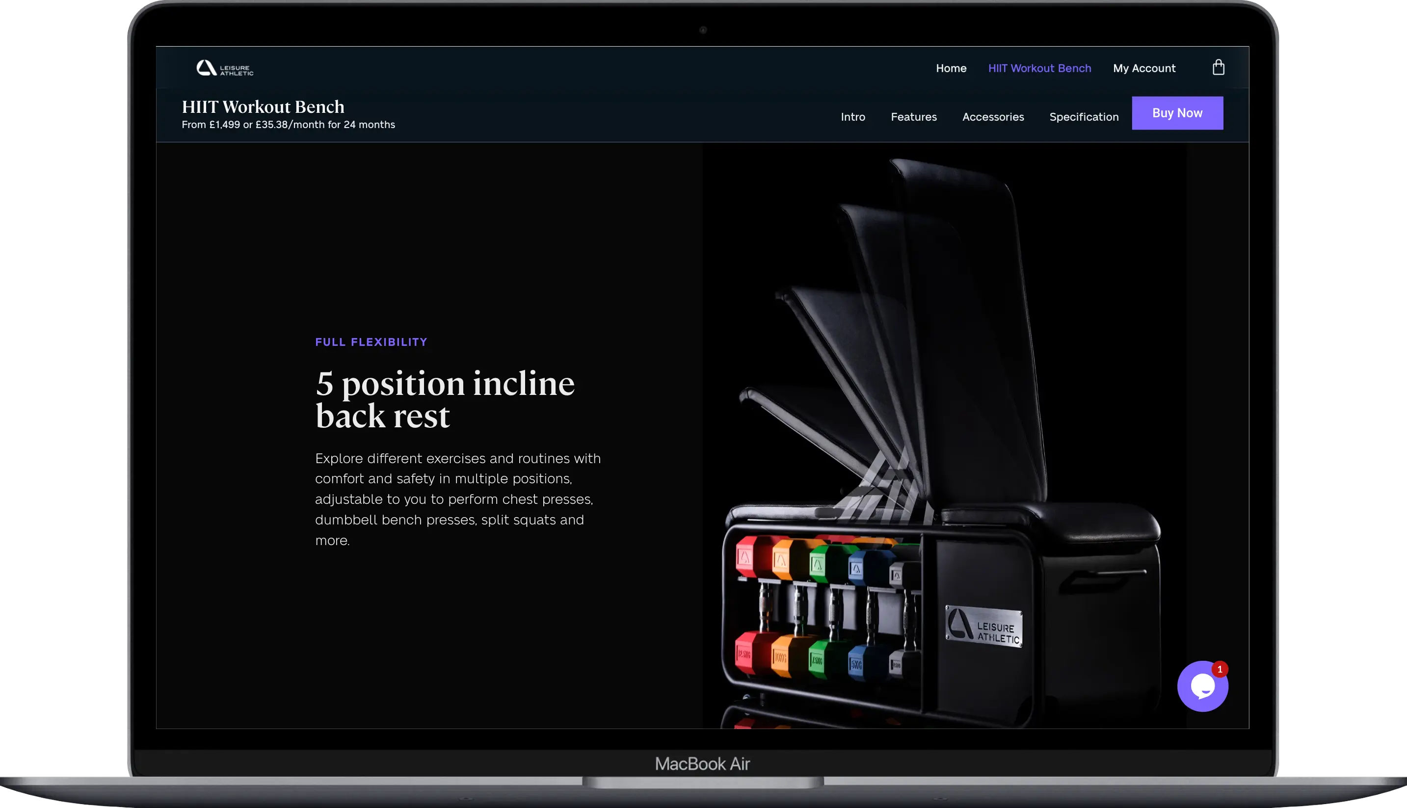
LEISURE ATHLETIC

Visual Identity for a range of premium home exercise equipment

The demand for home exercise equipment is a rapidly growing market with the Covid-19 pandemic accelerating the requirement and need for home-based equipment. With over 50% of UK consumers purchasing workout products since 2020 and over 75% of them stating they will continue to work out at home, the home exercise equipment market is rapidly growing.

Leisure Athletic is a premium home exercise company that manufactures high-quality equipment that is design-focused, durable and long-lasting.

They required a brand that positioned them in the premium exercise equipment market and elevated them to a reputable and respected brand.

Brand Marque and icon

The Leisure Athletic brand mark is the graphic combination of the letters ‘L’ and ‘A’ to create a mark bold enough to use on its own or with its logotype.

The Visual Identity

Leisure Athletic had two core ranges – the Active range and the Recover range. Each range has a core group of products which we differentiated with a distinctive colour that works with the core brand colour.

A dark midnight black sits alongside a complementary colour palette of a vibrant, energetic purple for ‘Active’ and a calming and trustworthy blue for ‘Recover’

We created a distinctive typographic style by mixing the contemporary serif typeface, Cambon with the sharp sans-serif Neue Alte Grotesk. The mixture of typefaces allows a flexible system that gives the brand personality and a tone of voice. The flexible design system allows playful scale and hierarchy across brand applications.

“The branding has made such a difference already. We can’t wait to get out there and wear our hoodies and T-shirts with our new branding.”

Alissia Jackson, Charity Manager

Related Work

Got a project in mind?

Let us unleash it...

If you are looking to take your brand and communication to the next level, speak to the team on 01625 315 075 or email info@lyfestudio.co.uk

Branding and Design Agency